GS11 Foundation Portfolio 2011
Friday, 8 April 2011
Thursday, 7 April 2011
Evaluation of OUTBREAK!
In this 3 minute clip, the shower scene alone with the unknown murderer has over 40 different cuts at a very quick pace showing the dramatic end to the female characters life which creates and directs so much tension towards the audience.
We used many fades for the beginning of our opening sequence as we thought that fades build up tension more than straight cuts would, and is also a clever way of building up suspense for the end of the sequence. After the main title we use straight cuts to build up more tension and make the pace quicker towards the end of the sequence.
The clip above is the opening titles to the 2009 film 'Orphan' we got the idea for the use of fades from this opening title sequence as we felt extremely anxious and tense when we were watching it and we think this is because of how the fades made everything much slower paced which we liked.
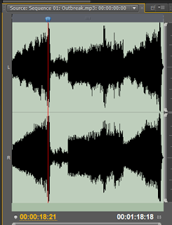
Audio: One of the main piece of audio we used is strangely called Outbreak and when we listened to it, we thought it built up suspense in the right way and had perfect timing to it. I think that timing is important to a good opening sequence as music tracks should match the type of action that is going around on-screen. Our music is a dominating function in our opening sequence as it guides the action that is on screen, however due to the mix of instruments used such as heavy drums and yet a light piano sound, it doesn't completely dominate and isn't too loud. We have also kept some of the original diegetic sound from the filming in the forest such as the birds singing because we think this pleasant yet eerie sound may confuse the audience, in a way that they might be anxious to what happens next.In most/every Thriller movies the lighting is very sinister to give off a mysterious effect and give an eerie atmosphere,many films show this such as Seven and Sin City. We chose to follow this convention through as it's a simple way of creating a sinister atmosphere to a scene and we used this mainly in our title sequences and the footage of the labs where only one lamp was used. We made the lighting dark in the lab scenes to create mystery for the audience to what the chemicals they are using, however in the forest scenes, they were quiet well light as we wanted it to contrast, the light may confuse the audience as to the genre but as the tension builds then it would be easily recognisable.
 In our opening sequence, non of the MAIN characters are introduced, but the characters we do introduce are the main characters for the first storyline, however we don't see the faces of the character making it more surreal and a mystery to the audience. We imagine the female in the opening sequence to be a main part in the rest of the film also, if we produced the film even more. Also doctors and scientists would be introduced and shown to be the main characters who try and solve the outbreak/disease with the help of the female girl.
Normally in a thriller movie, a female is the young, vulnerable one who gets hurt first, however in our opening sequence, the male is the first victim to be struck by the liquid sourced disease. We went against this convention to show how the male in the story can also be the weak one and the female can be the heroin who saves the day. We also used Jay who looks like a strong male to show vulnerability in a strong man also, perhaps showing that this is a deadly virus/disease to the audience. By going against this convention in most types of thriller, we risk the attention from the audience and there anxiety of what has happened to the 'poor innocent woman' however gain the questions like 'how could this happen to a man?!'
• How does your media product represent particular social groups?
Our characters in the opening sequence are in their late teens and we think that our film represents teenagers being innocent and irresponsible at the start but if we continued the film, I would then to show integrity and responsibility through the character, helping solve the disease.
In our opening sequence only one of the main characters are shown and if we were carrying on the rest of the film the main characters would be introduced later. We are not really able to follow the protagonist/antagonist convention of a thriller film, however we have protagonists in our opening sequence to show the innocence the teenagers bring. We have purposefully made the relationship between the two characters very vague and not obvious as that gives more question for the audience to ask.
The type of distribution company I would like mine and Rachel's film would be companies such as 'Warp' or 'Working Title' as they are independent film companies that work with smaller budget films. This is due to the quality of films they make even though they only have low budget for it. Of course if I had the money I would aim our film at the bigger distribution companies such as 'Warner Bros' as they distribute a variety of films and are very well known for distributing some of the best films ever made. Due to some of my research, I have found out Warner Bros are distributing a upcoming new film (October 2011) that comes under the sub-genre of medical thriller called Contagion. Weirdly, one of our original ideas is extremely similar to the storyline and Contagion was one of our name choices.
I would relate our film to be something similar to Cloverfield (2008) or 28 Days Later (2002) as it follows the same storyline in some ways such as a virus/monster taking over the world/country and also because they have an extreme independent feel about them, perhaps due to the rich story lines, unique camera angles and special effects (Cloverfield) .

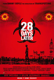
Another film that inspired my distribution choices and filming ideas was 28 Days Later directed by Danny Boyle and distributed by 20th Century Fox. The budget of £8 million was extremely lower than Cloverfield's due to the fact that it's a British film and we don't have big funding production companies like America do. However even though this film had a small budget, it grossed at $82,719,885 altogether worldwide, showing that even though the film may have a small budget and not famous 'blockbuster' actors, the distributors sell the film to the audiences by making them appealing etc, therefore achieving huge profits like this film did. I was inspired by this film as it involved a scientific beginning that didn't turn into a medical thriller that we as a group wanted to show, however it didn't follow this sub-genre through and turned into a zombie/horror film, which is some ways helped us also with our idea processes.
• Who would be the audience for your media product?
Our opening sequence is quite dramatic and it some ways edgy and confusing to suit the male characters frame of mind, so I think a younger target audience is appropriate as they may be attracted to this concept more and maybe even understand it more as we have gone down a psychological route also. However saying this, from the questionnaire that I conducted a few months ago, it showed that the older audiences do like medical thrillers as they're 'interesting' and 'attention grabbing', this is why we chose this sub-genre as we could adapt it in the way we wanted to. We adapted our idea first by following the medical thriller sub-genre, however adding some young and unique edges that would attract a younger audience, such as the distorted camera angles/effects and even the age of the actors we used.
• How did you attract/address your audience?
I think that the settings for our filming would grab attention as they're quite unusual and perhaps making the audience ask questions towards the film such as 'why are they in the forest or what's the lab for' therefore addressing the audience. We think that the scary/suspenseful music that we chose for the piece, holds the filming together due to the different times of tension etc. Me and Rachel thought when watching our piece again that the music fits perfectly with the action therefore tying it all together to give it a much more eerie atmosphere.
I have asked a few of my friends from college their opinions of our opening sequence and maybe how we could of improved if we had another chance:
Andrew Tinley- Year 13:
Rosie Atkin- Year 12:
• What have you learnt about technologies from the process of constructing this product?
I also learnt that rules in Media can be broken sometimes for example to create an effect and as a group we went ahead with this. We broke the 180 degree rule to create a edgy and disorientated piece so that the audience don’t know where to look and where the characters were walking from.
• Looking back at your preliminary task, what do you feel you have learnt in the progression from it to the full product?
I knew from the end of our preliminary task that I wouldn’t of been able to cope doing the main project on my own due to my lack of knowledge in the subject itself, and even with gaining more confidence in the subject, I would need someone who would give me advice on what to do, what would look best and have someone there to make decisions with and for the most part my media partner; Rachel, was that person who I did this with.
I also learnt from the preliminary task to the main task that editing on footage can be over used therefore making the film look less professional and I now know that in some cases, less is more. I loved our preliminary filming and I think we could have probably progressed and made it into a main piece of filming however I think our preliminary filming and editing was worked on too much and we took editing it too far. I learnt from this by not focusing on what editing would look better but what editing techniques would add more to a film and what it could possibly symbolise.
I know that due to the mistakes we made with our groupings that ‘Outbreak’ could have been so much better but due to the timeframe we left ourselves with, we didn’t have the a great deal of time to know which camera angles would give effect, how we would show pain or even the filing quality but I think that we have produced a real attention grabbing piece of film, that builds tension and suspense well that our target audience would connect to.
Editing- Project 2!

Filming- Project 2
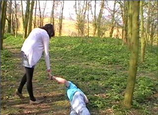
For our idea, the main idea was to create a setting where the audience would wonder why they were there and we think that placing it in a forest would not just add tension and suspense but to add to the mystery of the rest of the film and what could/would happen.
We set up the camera and took it to the forest at the back of the school field. This is a small wooded area that is well lit because there's not too many trees to block natural light, however there's enough trees to create a tense atmosphere to the opening sequence.
We planned to shoot in the day, so when we came to the editing stage, we could use after effects to change the time of day by darkening the background if we wanted to but if we don't want to then, we can edit it how we please, to get the effect we want.
We used many variety of camera angles such as long shots, mid shots and also tracking shots that tracked the fast action. We wanted to use long shots and establishing shots to show off the setting and make the introduction to the main characters as clear as possible.
Me and Rachel believe that this day of filming went well as the weather was perfect as the sun peaked through the trees to give us enough light and the condition of th forest floor was okay and not too difficult for us to film. I filmed for this as both Jay and Rachel were in the film, I found it hard because I hadn't become comfortable with filming yet, just the editing and I didn't want to mess it up due to my lack of experience. However after filming, I felt slightly more confident and more expressive with the different variety of camera angles and positions we could use.
Day 2- George Spencer Academy- Science Lab.
We filmed in a school lab one lunchtime to shoot this scene and we set up many bottles etc with liquids in them. One of the liquids obviously being the poisonous one.
We used a variety of equipment from the lab, such as beakers and microscopes to portray to the audience that this is something to do with science or is involved in the medical genre.
We used many different camera angles also such as high angle shots and close ups to show the detial of the beakers and also the action/what is going on in the scene.
I felt a bit more confident filming this as I knew exactly what I wanted to achieve and that was to create the same effect as CSI programmes do which is to use small snapshots such as close ups of thee bottles, just to give the audience a hint to what the story may be.
In the next lessons we are going to have to work hard to edit our film the way we want to in time as we're cutting our time fine to get this done. We have decided the main stuff we want to achieve with the editing but it's just making sure we have enough film to complete it and get the point across to the audience that we want to.
Tuesday, 22 March 2011
What others thought... of our previous project, DRAFT!
- Emma Ford: "Good original idea but needs more work to it, such as music and editing"
- Richard Kish: "Make the storyline more understandable"
- Steph Chawner: "Good storyline, camera angles to be sharper, but good variety of them"
- Frankie Burchill: "Love the original idea but needs a bit more work to it to make the rest of the opening sequence a bit more understandable"
BIG CHANGE!- Deciding to re-shoot and start new project!
New Idea:
The new idea is again still in the sub-genre of Medical thriller however we followed a slightly different route:
- Instead of cat scratch infection, it's a poisonous liquid infection. We thought this was more mature and professional also we beleive that audiences will understand the characters and storyline better.
- Instead of setting it in a 'student house' which we beleive wasn't obvious to the audience in the first place, we made it a school/forest setting. We want to do this to reach out to the target audience more and make the opening sequence more understandable than the previous one. We want the opening sequence to leave the audience with a few questions but we found that when we watched opening sequences from popular thriller films where hardly information was given to the audience, that we were a bit confused and we would of prefered a little bit more information for us to question such as 'what's going to happen next?' etc.
- Change of the main characters: Before we had 2 main female characters but we decided in this story line that a male and female of late teenage years would be more suitable as we wouldn't make the relationship between the 2 characters obvious so this would be another question for the audience to ask themselves making them want to know what happens in the 'rest of the film'.
Friday, 18 March 2011
Me and Rachel's Editing- Day 1!
When next week lesson comes, we plan to fix the cutting in the scenes, add effects onto the titles such as scratch marks etc to link in with the theme/topic and add a lot more effects though out the transitions and film. I think colour would work better with the filming we have done as it would work more with our topic and black and white would be a bit too harsh for the opening sequence I think.


